 1.
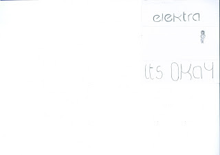
1.For the front cover of our digipak, we had two different ideas within our group, and at first we couldn't decide which one we wanted to go with. We asked the two other members of our groups what they thought, as well as other students in our class. The majority went for idea two, which is why we have decided to use that one. We felt as though idea one was too vague and lacked any eye-catching features. We also thought as though the other idea was more sophisticated and creative, as well as having an actual photograph of the artist on the front cover. We devised this together as a group, with Priya doing the illustration. We thought that after looking at digipak's similar to our genre, we should have the images inside relating to our story but at the same time maintaining our enigma. The four sections of our digipak all reflect the storyline and genre of the track.

No comments:
Post a Comment